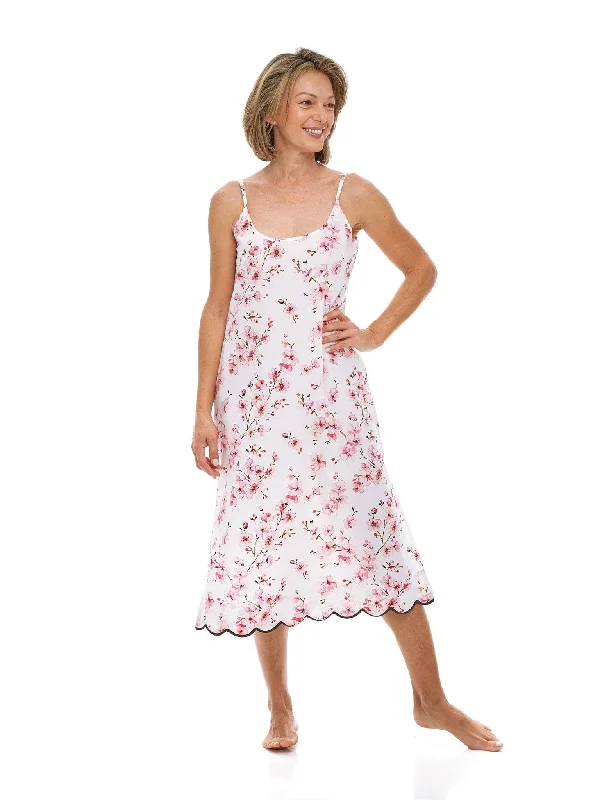
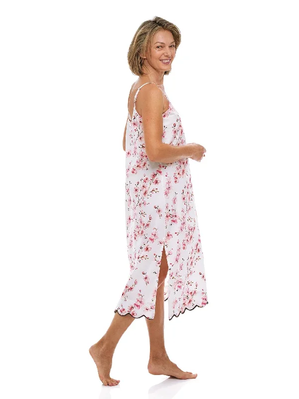
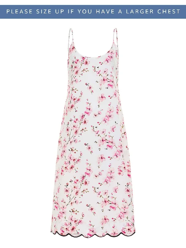
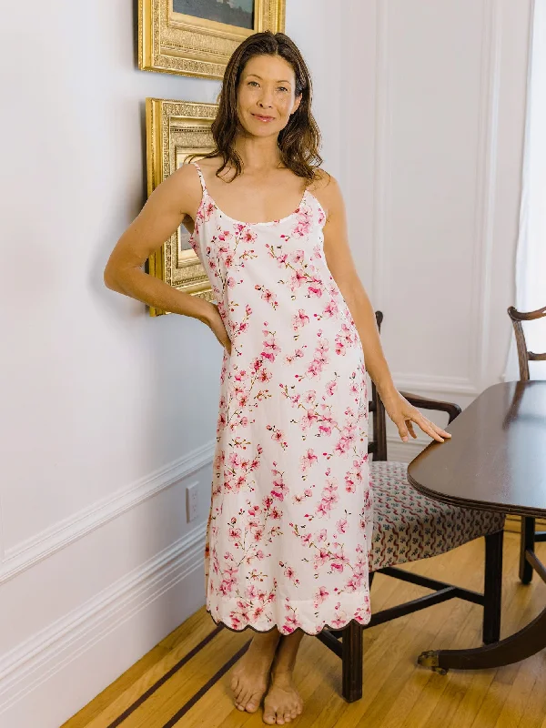
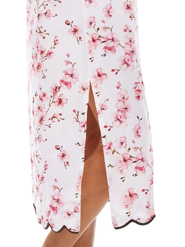
Always in style, Heidi's classic slip nightgown promises a peaceful sleep draped in super soft, lightweight cotton. The subtly feminine silhouette with flowing skirt and fitted bust offers an alluring alternative to traditional shift nightgowns, while a scalloped hem in chocolate brown adds a sophisticated finish you won't find in everyday sleepwear. Offered here in my cherry blossom print that captures the beauty and optimism of each flower as they bloom in the spring
Looking to make this the perfect gift Don't forget the personalized gift-wrapping option when adding this lovely nightgown to your cart.
- Runs small in the chest area
- Soft, cool cotton forms a slight A-line fit with a close-fitting bust and adjustable straps
- Hand-painted floral design
- Delicate scalloped trim creates a soft, feminine finish
- Customers say: ""Love the fabric, it feels wonderful!""
- Hand block printed by local artisans in the Rajasthan region of India
- Handmade luxury, designed in California
- If you have a larger cup size, we suggest ordering the next size up
Print Story
Is there any more hopeful flower than a cherry blossom None that I can easily bring to mind. That very first sighting on a late winter/spring day is an emotional uplift I look forward to as soon as winter begins. I had a similar feeling as I got ready to launch my latest print; the Cherry Blossom!
I have prioritized my floral designs around my favorite flowers and this little blossom might be the exception to the rule. I don’t consider the cherry blossom a flower in the same sense as the hydrangea or the lily of the valley, yet it is a flower that makes my heart race when I see it. Last spring (which means February in California) I was driving along a beautiful country road lined with blooming cherry trees. The sight was spectacular. It was at that moment I decided to create a print that might make customers feel the same way when they wore it.
The cherry blossom print is one of my seasonal prints offered beginning in late february and then going away a short time later as the days warm up and the nights get longer. I worked long and hard to strike a balance of colors that were flattering and true to life. At first I experimented with a very impressionist version of the flowers, but in the end I decided on a style that clearly looked like cherry blossoms. All my prints are drawn by hand so there is a natural softness to the lines and colors which makes it special.
One last note on the design which was a bit controversial….the color of the trim. I chose to use a chocolate scalloped trim rather than the more obvious pink or red. Why I think it’s more sophisticated and actually softens the pink and red colors in the blossoms, I love it. I hope you love it too.

